

D'Oro
Olive Oil Product
Branding
Packaging
OOH
Designed by Olive Oil.
Some brands are inspired by their product.
This one was made from it.
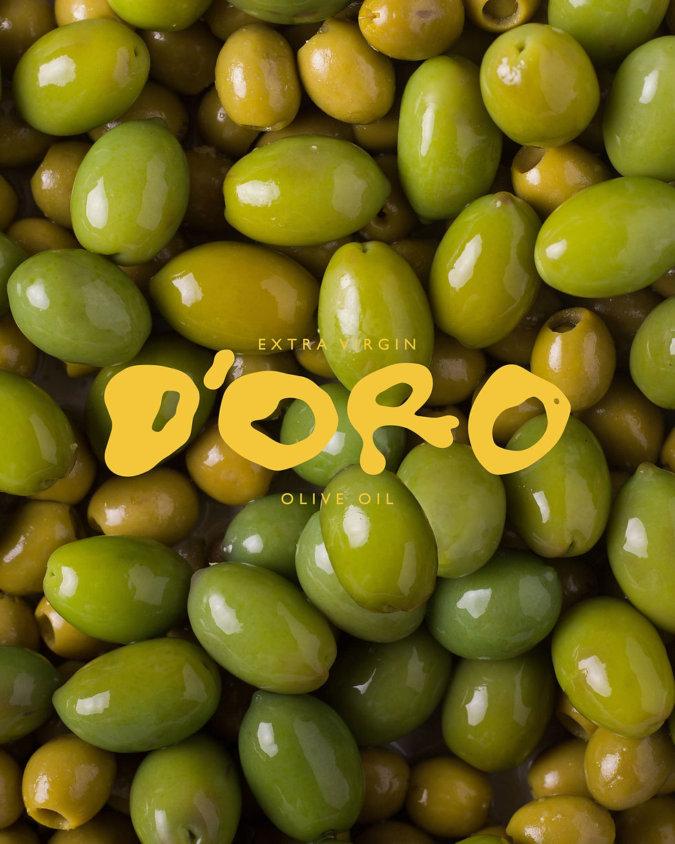
The D'Oro identity began by pouring olive oil onto a surface and letting it find its own shape. Those natural forms became the foundation of the logo, creating a mark that's impossible to replicate and inseparably linked to the product it represents.
From there, the rest of the identity followed—bold colours, honest typography and a visual language that celebrates the simple pleasure of really good olive oil.

Crafted by Nature
The identity celebrates the beauty of simplicity. Inspired by the rich colours of Puglia's olive groves, the visual language pairs deep greens with warm golden yellows to reflect the product at the heart of the brand.
Every graphic element takes its cue from the natural movement of olive oil, creating a system that's fluid, tactile and full of character.

Made to Pour
D'Oro was designed to live wherever olive oil belongs—from kitchen shelves and market stalls to cafés, restaurants and dining tables. The flexible identity extends across packaging, transport, advertising and social content, creating a brand that's bold enough to stand out while remaining rooted in authenticity.
Like the product itself, the brand is uncomplicated, generous and made to be shared.

