

PQA Venues
Fringe Festival Venue
Branding
Event Visual Identity
Merch
Wayfinding
The Home of Fringe Performance
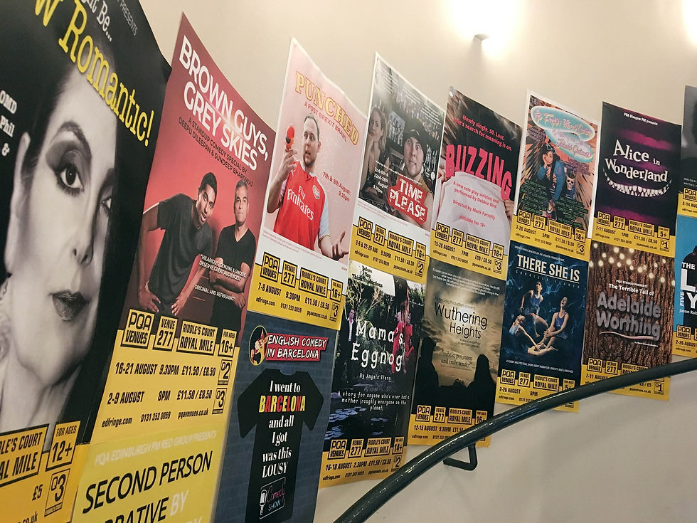
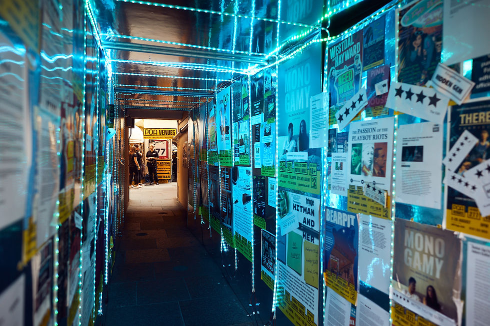
PQA Venues became one of the busiest destinations at the Edinburgh Fringe, welcoming thousands of performers and visitors throughout the festival. The identity was designed to cut through the noise of one of the world's biggest arts events, creating a bold, instantly recognisable brand that guided audiences from the street to the stage.

Designed to Stand Out
Inspired by the energy and pace of live performance, the visual identity combines high-contrast colour, bold typography and a robust graphic system built for maximum visibility. Every element was created to be clear, confident and easy to navigate, helping audiences find shows while giving the venue a distinctive presence amongst hundreds of competing events.
The Challenge
The core challenge was translating the unique character of Pub in the Park — part celebration, part experience into a visual identity that could work across:
-
Multiple cities and dates
-
Large-scale environmental graphics
-
Signage and wayfinding
-
Apparel and merchandise
-
Digital and printed collateral
The visual system needed to be loud and playful enough for festival environments while maintaining clarity and consistency across all touchpoints.
Approach
To meet this, the design strategy focused on a bold and energetic graphic language that could be easily adapted for different locations and touchpoints.
Rather than a single static logo, the identity used adaptable motifs and type treatments that could breathe and shift depending on context:
-
Larger-than-life typography for environments
-
Distinctive icons and patterns for activation zones
-
Playful colour combinations to reinforce the festive experience
This allowed the brand to feel dynamic and flexible while keeping a strong overall identity system.


Built for the Festival
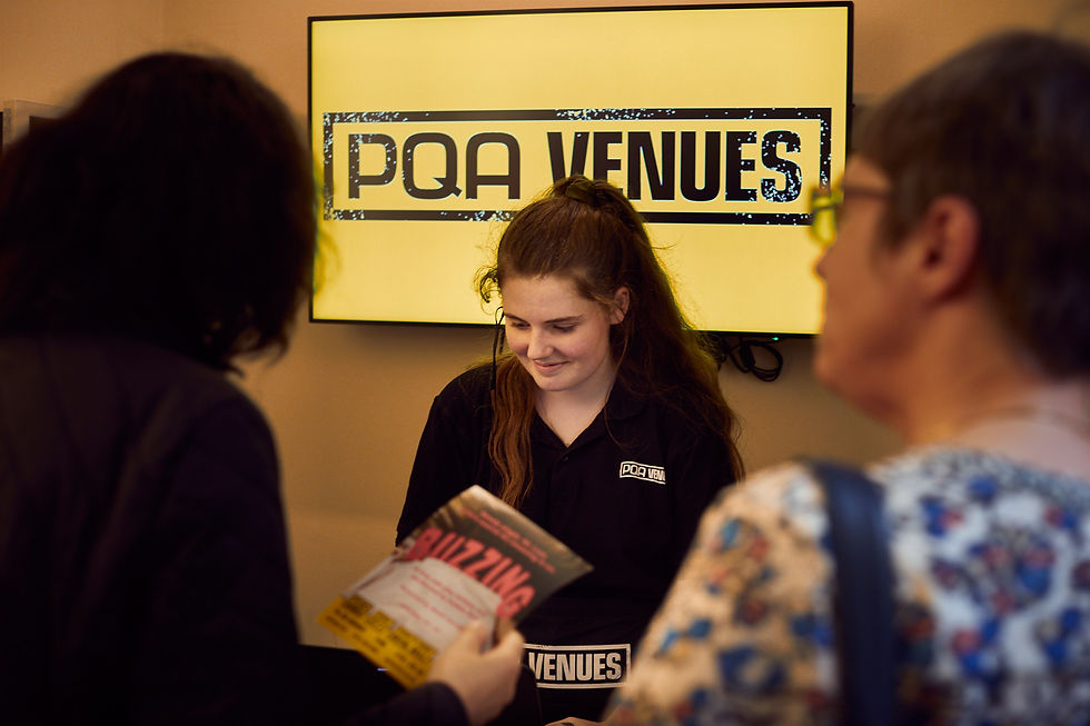
From venue signage and wayfinding to programmes, staff uniforms and promotional materials, the identity was designed to work across every touchpoint of the visitor experience. Adopted throughout the venue and seen by thousands during the festival, the project helped establish PQA Venues as a standout destination, contributing to its recognition as Edinburgh Fringe's Venue of the Year.
Concept Development
Early explorations centred around building a visual vocabulary inspired by:
-
The social, communal nature of the event
-
The sensory experience of food, music, and outdoor gathering
-
The need for high-impact visibility in busy event environments
Concept iterations explored how the identity could expand across scale, from tiny badge icons to massive onsite banners, making sure that it remained readable and engaging at every size.
The Solution
The final identity draws on strong typographic energy, flexible graphic motifs, and vivid colour to create a recognisable look and feel across all formats.
Key elements included:
-
A bold, adaptable wordmark and type system
-
A suite of visual motifs that support branding hierarchy
-
Flexible colour builds that work in print, digital, and environment
-
Modular graphics that could be tailored for individual cities or stages
The system reinforced the personality of the event: sociable, energetic, and memorable.

Applications
The brand was executed across a range of physical and digital touchpoints:
-
Large-scale festival signage and stage branding
-
Wayfinding systems throughout site layouts
-
Event programmes and printed collateral
-
Apparel, merch, and lifestyle graphics
-
Social graphics and digital promotions
Each application retained the core identity while adapting to its specific context, helping attendees identify and engage with branded environments instantly.
Outcome
The Pub in the Park identity successfully delivered a dynamic and recognisable brand presence across multiple UK locations. Its energy and adaptability helped bring the festival experience to life in ways that felt exciting and clear for attendees, staff, and partners alike.
The flexible nature of the system meant it could be scaled confidently across cities, stages, and formats while retaining a sense of unity and purpose.
A vibrant, adaptable event identity designed to energize festival environments and create clarity within lively, multi-layered experiences.